As teenagers, we didn’t really pay attention to our parents telling us to clean our rooms. Probably because we were all in our rebellious phase or simply because we found the task very time-consuming and annoying. Regardless of which exact way our thoughts functioned back then, one thing is very clear, we underestimated the importance of the task and the role it plays in our overall professional life.
Assuming that you keep your room clean as a grown-up, you must feel relieved when you can find things when needed and don’t have to worry about people visiting.
The same is the case with your websites. In simple words, people find it relieving when they can browse through your room and find what they’re looking for with less mental effort, which in this case is your Website.
An appealing and simple-to-operate website is worth its weight in gold. And it’s directly presented in a way you don’t actually have to clean your room. let’s find out how to improve website performance.
15 ways to improve your website
1. Add a Value Proposition
The value proposition focuses on informing your visitors about what you do and why you do it. Try to place your value proposition on your home page or in your headline.
Letting visitors know about your work creates a deeper personal bond that will help develop a professional connection. But make sure to put up a fair game by letting them know what they will be getting if they opt for your services or product.
The Value Proposition, also known as a Mission Statement could look something like this.
[our company] is where
[our audience] gets
[what information] that offers
[what benefit].
2. Website Navigation
Website Navigation’s usual function is to help your search engine rankings and help users find what they’re looking for. Obviously, your visitors should come first and search engines second.
So humanize the text and use words that your visitors could relate to, which would mean fewer clicks and indicate your relevance to search engines.
And On A Side Note, We Are A Website Development Company in Jaipur, that would love to assist you on your website’s journey
3. Call to Action Text
CTA or call to action text is what you use once users are on your site. Now you can tell them exactly what to do next! Basically, it’s a prompt that directs your site visitors to take a certain action.
For instance, you’re selling beauty products, and you create a webpage filled with details about the products. You advertise it and get a lot of visitors to your site.
Now if you don’t include prompts like Sign Up Now or links to take you somewhere on the page, which would mean you’re just giving out information about products without reminding them to consider purchasing your products.
It’s best to use the 1st person’s narrative(Me, My, I) in your CTA.
For Example- Download My Guide.
But feel free to optimize according to your services. The ideal place to set your CTA is usually near the top of your homepage, so your visitors don’t have to try hard to find it.
4. Call-to-Action Colors
Find a nice contrasting color for your call-to-action buttons so it’s appealing to the visitors on your site because it adds aesthetics to the page and makes it look neat and clean.
For Instance, If your site is predominately blue, or colors of colder shades then find a nice warm color like orange or yellow to go with it, for the CTA.
A nice combination of colors or simply appealing accents would call attention to itself and in doing so would increase the overall allure of your website.
The act of providing users with a button to click on and some basic information about what could happen makes them more likely to actually go through with it.
5. Try The 10-Foot Test
The 10-foot test is a little unorthodox, where you have to look at your home page from a distance of about 10 steps or better yet, get someone else to try looking for what the site is trying to convey.
It lets you know whether you’ve done a good job with your site or not.
Because if you can understand the message your site is trying to convey from a distance then it means you’re good to go. If not, try to think of a better way to include your message on the homepage so it fits more comprehensively.
A simple and well-placed CTA could help make it easier to comprehend too, so make sure you include all the necessary things that would help navigate the visitors.
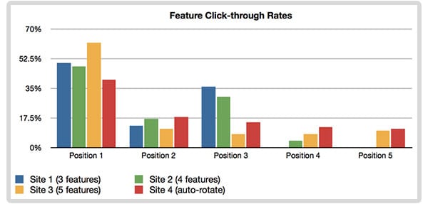
6. Carousels
Carousels are basically just slides of your products or image gallery,
Consider this study by Erik Runyon, which shows that user interaction significantly declines after the first slide. So if you decide to use carousels for your site, keep it three at most.
Erik also shows that auto-forwarding could be a bad idea because the motion actually distracts the visitors.
It might seem a little counter-intuitive but the human mind is hard-wired to be distracted by motion.

But that doesn’t mean that you shouldn’t have a carousel for your products or your image gallery because it’s actually useful to those on mobile devices.
It’s still important to make sure that your slides offer something of value, if not then you should probably just skip using them.
7. Social Proof
Social proof is a useful tactic that could help your visitors commit to your site and help establish trust from an earlier point.
Get Influencers from a relevant field to provide a quote or statement about you, your services, or your products.
8. Testimonial Pages
Realistically no one would willingly visit your Testimonials Page because no one really wants to hear your praises.
But it’s still really important to display your credibility in the form of praise. So the best way to manage that is to scatter the good things people are saying about you, throughout the site.
So it’s easily accessible by anyone that visits your site and helps establish trust similar to Social Proof.
Site example
9. Team Pages
People like to connect with things that represent the core of being human. Through Team Pages you can share behind-the-scenes pictures of your workplace culture.
Because people conduct business with people they can trust so let the essence of your humanness pour out in your team pages.
You could use individual team pages too because that would increase the likelihood to rank in search engines when people search specifically for your name.
But if you have the whole of your team on a single team page then Google wouldn’t know which person to rank the page for.
10. Mobile-friendly
For websites to be mobile-friendly hasn’t been valued more than it does now. In a time when everyone owns and uses mobile devices for almost everything, knowing how to improve website performance and make it mobile-friendly has become imperative for businesses.
To explain the extent of its importance, I will shed some light on how it affects the ranking.
Google ranks mobile-friendly websites higher than the ones that are not, given that a lotta people only use mobile devices to access websites, it becomes crucial to implement features that would prioritize user experience.
Would adding Pinch and Zoom suffice?
Adding the pinch and zoom does make your website more usable than before but having trouble clicking links and reading texts would only frustrate visitors and decrease the chance of people actually choosing your services.
11. Internal Linking
An internal link is a link from one page to another page on the same domain. In simple words, they’re text hyperlinks from one page to another page on your website.
It keeps visitors and bots on your website for longer durations and keeps them in motion.
For instance, you can link service pages to your homepage and make sure to include the name of the service so the users can know what to expect after clicking the link.
12. Email Sign-Up Forms
The 3 P’s is the rule that would help understand and implement sign-up forms.
1. Visually Prominent
2. Proof
3. Promise Something
Make it clear what visitors are signing up for. Because it’s important that users don’t spend time on your site being confused about what they might be getting into.
Specifying each of the P’s is the way to go.
Have a Visually Prominent Page. Then show proof by sharing a numerical fact of something like people who subscribed. Then promise that they’ll be getting articles or ebooks if they subscribe.
It’s completely up to you whether you offer daily articles or an ebook or regular emails of your new deals and products.
13. Forget The Fold
Scrolling is the single most natural action users take on the internet. Yes, more attention is paid to things above the fold because it’s the first thing you see, but that doesn’t mean people don’t scroll and it doesn’t mean you have to stuff everything “above the fold.”
Put your most important messaging at the top and give your users a reason to scroll if needed. If you try to cram everything above the fold, you’re going to end up with a page that looks like this…
People usually think that no one really scrolls below the fold. But as someone who wants to create an awesome website, you will have to consider the studies that prove the contrary.
Scrolling is the most natural action users take on the internet, no matter what device they’re using. Sure, the stuff above the fold gets the most attention because it IS the first thing the user sees. This means you don’t have to put everything above the fold, often it would cram up, making it look unappealing and unorganized.
Simply put, add all the important messages and content at the top and only give your user a reason to scroll if needed.
14. Email Addresses vs. Contact Forms
The main purpose that the contact form serves is to allow you to collect data and track conversations. With each form, you could try using a unique thank-you page, so it’s easy to track where the conversations are coming from.
Try setting up google analytics to track campaigns and set goals. Now if you were to use emails there’s no way to tell if the message was received until the person responds back. This won’t be an issue with contact forms because it makes sure that you know if the message was received through an “auto-response” email.
Apart from tracking conversations, contact forms are easy to fill out and offer a lot of additional features that would help in the long run. It could help you decrease the number of spam emails, by getting rid of publicly displayed email addresses.
Having a neat and clean contact form displays professionalism.
And could potentially offer a lot more than just plain old email.
15. Thank You Pages
Thank you pages are arguably the simplest and most effective way to keep people committed.
Its potential is often overlooked. They give you an opportunity to have the user sign-up on your website for services like articles, newsletters, or downloading an ebook.
You could also offer coupons or have them follow your social media profiles.
But traditionally, adding a simple subscribe button and offering something would be a solid way to take the engagement to the next level. It could be used in lotta ways. For instance, if you’re an ecommerce website, offer something like a coupon if they subscribe or refer to a friend and see what the results are. As an added bonus, there’s practically no cost to add this but could significantly boost your business.
We happen to be one of the Website Development Companies in Jaipur that can help you with your website. Feel free to reach out to us.
Conclusion
In conclusion, improving website performance is crucial for success in today’s digital landscape.
By implementing strategies like optimizing loading speed, enhancing user experience, and refining site efficiency, you can attract more visitors, boost engagement, and achieve your online goals.
Take action now and elevate your website’s performance to new heights.
we hope our article on How to Improve Website Performance will be helpful.
keep reading.


